Widgets
Widgets are the primary content blocks on LaunchPad dashboards. LaunchPad combines two widget sources:
- Nextcloud Dashboard API widgets — every widget registered by an installed Nextcloud app, exposed via the v1 (
IAPIWidget) or v2 (IAPIWidgetV2) interface, plus the legacy callback-based widgets. - Registry-driven custom widgets — 25 in-app widget types. 17 are LaunchPad-native (defined in
src/constants/widgetRegistry.js); the other 8 are OpenRegister analytics widgets contributed by the communaldashboardWidgetRegistryin@conduction/nextcloud-vueand overlaid by LaunchPad's registry. Each entry pairs a Vue renderer with an Add Widget sub-form and adefaultContentshape.
This page documents the registry-driven catalog. For the full shared catalog (all 25 types with screenshots), see the Dashboard Widget Catalog in @conduction/nextcloud-vue (docs/components/dashboard-widget-catalog.md). For app-level Dashboard API widgets, see the host app's documentation.
Widget catalog
| # | Type | Display name | Icon | Use it for |
|---|---|---|---|---|
| 1 | label | Label | FormatTitle | Short, single-line headings inside a cell |
| 2 | text | Text | FormatText | Multi-line markdown / HTML / table content |
| 3 | image | Image | Camera | A single image (URL or Files-picker) |
| 4 | link | Link Button | LinkVariant | One-click action / external link button |
| 5 | nc-widget | Nextcloud Widget | ViewDashboard | Proxy for any installed NC Dashboard widget |
| 6 | header | Header Banner | ViewHeadline | Hero banner with overlay + CTA |
| 7 | divider | Divider | Minus | Visual separator (line / heading / whitespace) |
| 8 | files | Files | Folder | Inline Files browser (folder or file pin) |
| 9 | people | People | AccountGroup | Roster of users with filters & birthdays |
| 10 | quicklinks | Quicklinks | Star | Tile-grid of favourite links |
| 11 | news | News | RssBox | Aggregated RSS / Atom feeds |
| 12 | video | Video | Video | Embedded video (URL or Files) |
| 13 | calendar | Calendar | Calendar | Internal NC calendars + external ICS |
| 14 | links | Links | LinkBoxVariant | Sectioned link directory |
| 15 | menu | Menu | ViewDashboard | Dropdown / horizontal navigation menu |
| 16 | container | Container | ViewDashboard | Recursive sub-grid host (max depth 3) |
| 17 | tile | Tile | ViewGrid | Single icon-tile shortcut |
| 18 | stat | Statistic / KPI | TrendingUp | One headline number from an OpenRegister aggregate |
| 19 | delta | Comparison / delta | TrendingUp | Current vs previous value + signed % change |
| 20 | gauge | Gauge / utilization | Gauge | A value against a target, with warn/danger bands |
| 21 | stats-block | Statistic card | ChartBar | A labelled count card (GraphQL-backed) |
| 22 | chart | Chart | ChartLine | ApexCharts bar/line/pie over OpenRegister data |
| 23 | object-list | Object list | ClipboardList | A filtered page of OpenRegister objects as a table |
| 24 | table | Table | ClipboardList | Compact data table (external rows or self-fetch) |
| 25 | spend-analytics | Spend analytics | ChartBar | Procurement/finance spend (financeq + procest) |
How widgets are persisted
Every placement is one row in oc_launchpad_widget_placements:
| Column | Stores |
|---|---|
widget_id | The registry type key (e.g. label) — or a Nextcloud Dashboard widget id |
grid_x / grid_y / grid_width / grid_height | GridStack position |
style_config | Optional per-placement style overrides (JSON) |
content | Per-type configuration blob (JSON) — shape matches the type's defaultContent |
custom_title / custom_icon | Per-placement title/icon overrides |
tile_* | Legacy columns used by the standalone tile flow |
The content column was added in Version001025Date20260508060000 to make the registry-driven types persistable end-to-end.
REST API
| Method | Endpoint | Description |
|---|---|---|
GET | /api/widgets | List Nextcloud Dashboard API widgets visible to the user |
GET | /api/widgets/items | Fetch items for one or more widgets |
POST | /api/dashboard/{dashboardId}/widgets | Add a placement (accepts widgetId, grid coords, optional content) |
PUT | /api/widgets/{placementId} | Update grid / style / content of a placement |
DELETE | /api/widgets/{placementId} | Remove a placement |
Known polish items
- The wrapper still draws a "Widget" header above chrome-less types (
label,divider,header). The data and rendering are correct; the title row is just visual noise on those three. Tracked as a follow-up. - The Add button can stay disabled when the widget type is freshly switched in the modal until the user touches a sub-form input — the
validationTickwatcher inAddWidgetModal.vueonly bumps onupdate:contentevents, not ontypechanges. Workaround: edit any field once after switching type.
label
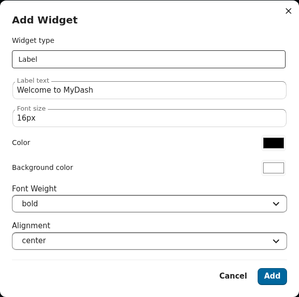
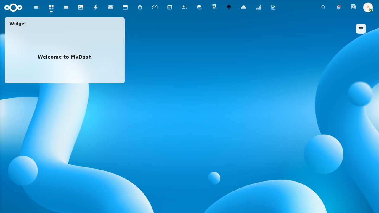
A short, single-line plain-text heading inside a dashboard cell. Content is rendered via Vue interpolation only (never v-html), so any HTML inside text is shown as literal characters — XSS-safe by construction.
Renderer: LabelWidget.vue · Form: LabelForm.vue · Spec: openspec/specs/label-widget/spec.md
| Field | Default | Notes |
|---|---|---|
text | '' | Heading text. Empty → renderer falls back to "Label". |
fontSize | 16px | Any CSS length. |
color | var(--color-main-text) | Empty = inherit theme. |
backgroundColor | transparent | Cell background. |
fontWeight | bold | normal / bold. |
textAlign | center | left / center / right. |
text
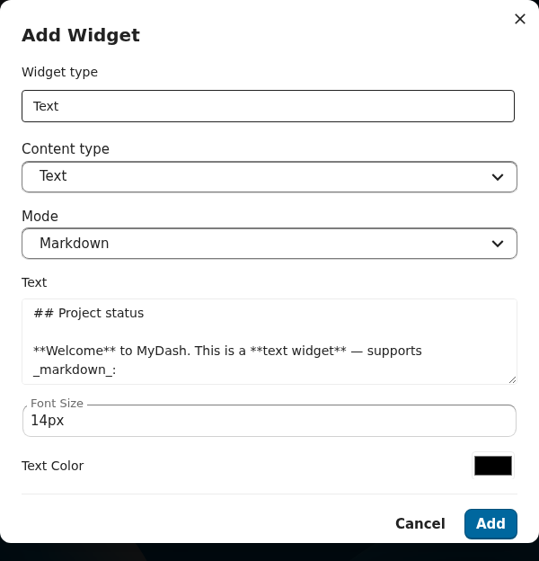
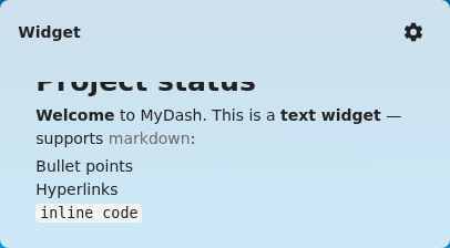
Multi-line text block with markdown / HTML / table rendering modes. New placements default to markdown; rows that pre-date contentMode fall through to the legacy HTML branch.
Renderer: TextDisplayWidget.vue · Form: TextDisplayForm.vue · Spec: openspec/specs/text-display-widget/spec.md
| Field | Default | Notes |
|---|---|---|
text | '' | Body. Markdown when contentMode='markdown'. |
fontSize | 14px | |
color / backgroundColor | '' / '' | |
textAlign | left | |
contentMode | markdown | markdown / html. |
tableMode / tableData | false / null | Switches the renderer to a structured table. |
image
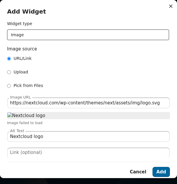
A single image with three sources: external URL, uploaded file, or a Files-picker pin.
Renderer: ImageWidget.vue · Form: ImageForm.vue · Spec: openspec/specs/image-widget/spec.md
| Field | Default | Notes |
|---|---|---|
url | '' | External URL or Files path. |
alt | '' | Accessible alt text. |
link | '' | Optional click-through URL. |
fit | cover | cover / contain / fill / none. |
link
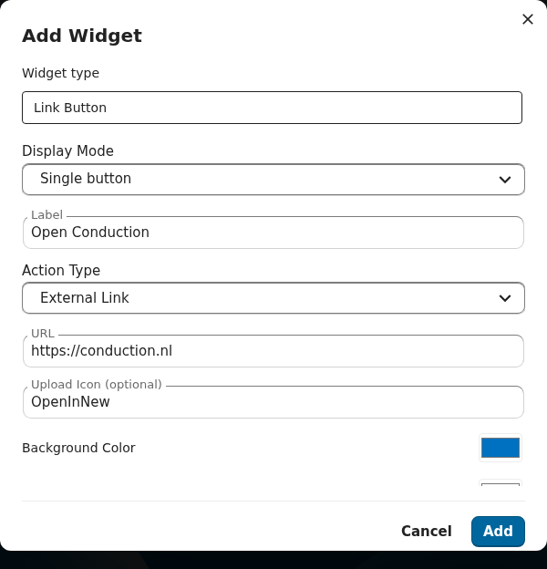
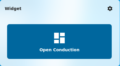
A single big call-to-action button. The displayMode='button' legacy mode draws one button; displayMode='list' toggles the alternate mode where links[] is rendered inline.
Renderer: LinkButtonWidget.vue · Form: LinkButtonForm.vue · Spec: openspec/specs/link-button-widget/spec.md
| Field | Default | Notes |
|---|---|---|
label | '' | Button text. |
url | '' | Destination. |
icon | '' | Material Design icon name. |
actionType | external | external / internal. |
backgroundColor / textColor | '' / '' | |
displayMode | button | button / list. |
listOrientation / listItemGap | vertical / normal | List-mode only. |
links[] | [] | List-mode children. |
nc-widget
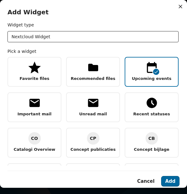
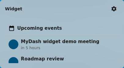
A proxy that mounts any Nextcloud Dashboard API widget inside a LaunchPad placement. Use it to drop the standard "Upcoming events", "Important mail", "Favorites", etc. widgets onto a LaunchPad dashboard.
Renderer: NcDashboardWidget.vue · Form: NcDashboardForm.vue · Spec: openspec/changes/nc-dashboard-widget-proxy/
| Field | Default | Notes |
|---|---|---|
widgetId | '' | Nextcloud Dashboard widget id (e.g. calendar, mail). |
displayMode | vertical | vertical / horizontal. |
header
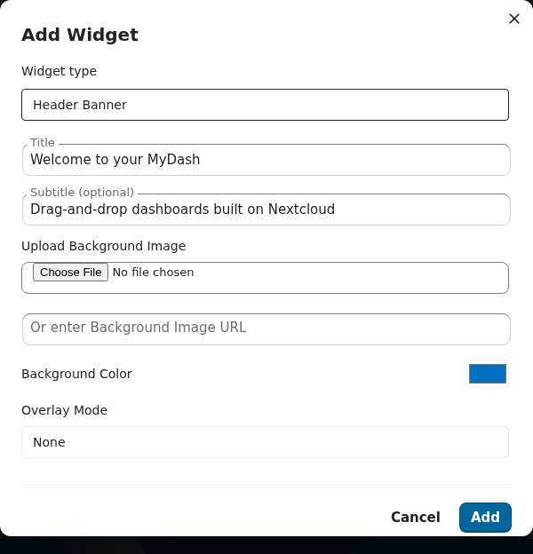
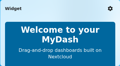
A hero banner with optional background image, overlay, vertical/horizontal alignment, and a Call-to-Action button. The form's validate() requires a non-empty title, http(s) for any background URL, and CTA label/url paired (both or neither).
Renderer: HeaderWidget.vue · Form: HeaderForm.vue · Spec: openspec/specs/header-banner-widget/spec.md
| Field | Default | Notes |
|---|---|---|
title | '' | Required. |
subtitle | '' | |
backgroundImageUrl | '' | Must be http(s) if set. |
backgroundImageFileId | null | Files-picker source. |
backgroundColor | '' | |
overlayMode | none | none / solid / gradient. |
overlayColor / overlayOpacity | '' / 0.4 | |
textColor | '' | |
textAlign / verticalAlign | center / middle | |
height | medium | small / medium / large. |
cta | null | {label, url, icon} or null. |
divider
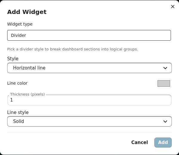
A visual separator between sections. Three styles:
line— horizontal line with optional thickness/color/styleheading-break— line + heading text (heading is required for this style)whitespace— pure spacing, no visible line
Renderer: DividerWidget.vue · Form: DividerForm.vue · Spec: openspec/specs/divider-widget/spec.md
| Field | Default | Notes |
|---|---|---|
style | line | line / heading-break / whitespace. |
lineColor / lineThickness / lineStyle | '' / 1 / solid | |
whitespaceSize | medium | small / medium / large. |
headingText | '' | Required for heading-break. |

files
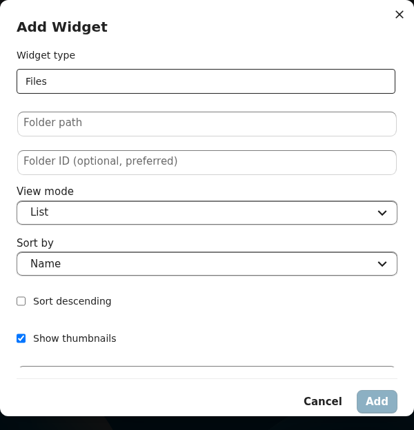
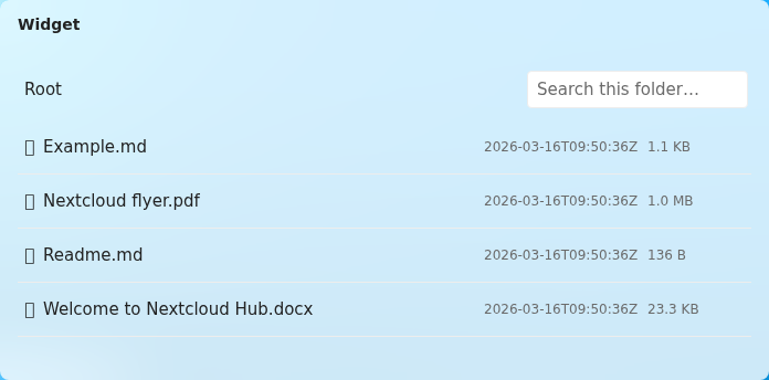
Inline Files browser pinned to a folder or single file. Supports search, sort, optional upload/delete, and a mime-type filter.
Renderer: FilesWidget.vue · Form: FilesForm.vue · Spec: openspec/specs/files-widget/spec.md
| Field | Default | Notes |
|---|---|---|
folderPath | '' | Absolute Files path. Empty = error placeholder. |
fileId | null | Pin a single file instead of a folder. |
viewMode | list | list / grid. |
showThumbnails | true | |
mimeTypeFilter[] | [] | e.g. ['image/*']. |
allowUpload / allowDelete | false / false | |
sortBy / sortDescending | name / false |
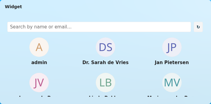
people
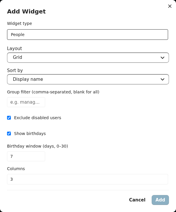
Roster of users with two selection modes (filter for rule-based, manual for hand-picked), per-field display toggles, and a birthday window.
Renderer: PeopleWidget.vue · Form: PeopleForm.vue · Spec: openspec/specs/people-widget/spec.md
| Field | Default | Notes |
|---|---|---|
layout | grid | grid / list. |
selectionMode | filter | filter / manual. |
selectedUsers[] | [] | Manual mode. |
filters[] / filterOperator | [] / AND | Filter mode. |
excludeDisabled | true | |
showBirthdays / birthdayWindowDays | true / 7 | |
sortBy / columns | displayName / 3 | |
showFields | {displayName, role, organisation, email, phone, avatar, birthdate} | All true by default. |
quicklinks
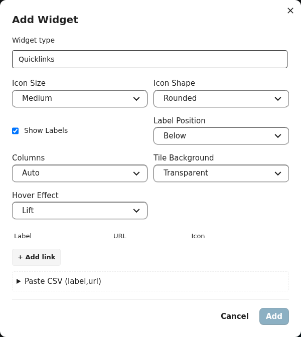
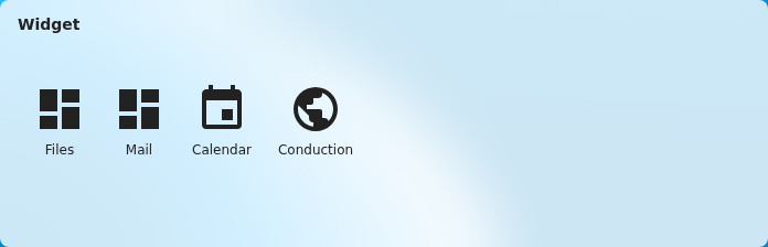
A tile grid of favourite links — each with its own icon, label, and color. Useful for a "starter row" or as a compact navigation cluster.
Renderer: QuicklinksWidget.vue · Form: QuicklinksForm.vue · Spec: openspec/specs/quicklinks-widget/spec.md
| Field | Default | Notes |
|---|---|---|
links[] | [] | {id, label, url, icon, backgroundColor, textColor}. |
iconSize | medium | small / medium / large. |
iconShape | rounded | rounded / circle / square. |
showLabels / labelPosition | true / below | below / overlay / right. |
columns | auto | Number or auto. |
tileBackgroundStyle | transparent | transparent / solid / outlined. |
hoverEffect | lift | lift / fade / none. |
news
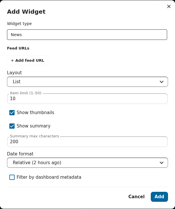
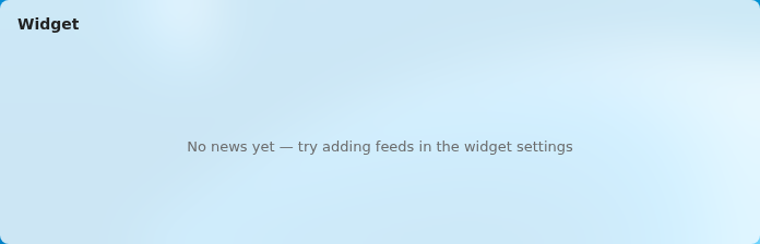
Aggregated RSS / Atom feeds. The renderer fetches via the backend (/api/widgets/news/{placementId}/items) so CSP and CORS aren't issues.
Renderer: NewsWidget.vue · Form: NewsForm.vue · Spec: openspec/specs/news-widget/spec.md
| Field | Default | Notes |
|---|---|---|
feedUrls[] | [] | One or many RSS/Atom URLs. |
layout | list | list / cards. |
itemLimit | 10 | |
showThumbnails | true | |
showSummary / summaryMaxChars | true / 200 | |
dateFormat | relative | relative / absolute. |
metadataFilter | null | Optional regex / category filter. |
video
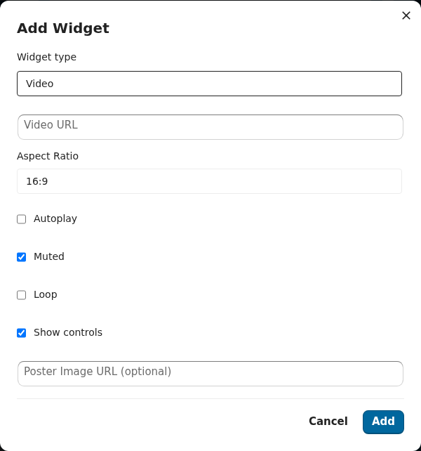
Embedded video — either an external URL (mp4 / webm) or a Files-picker pin.
Renderer: VideoWidget.vue · Form: VideoForm.vue · Spec: openspec/specs/video-widget/spec.md
| Field | Default | Notes |
|---|---|---|
sourceType | null | url / file. |
videoUrl | '' | Used when sourceType='url'. |
fileId | null | Used when sourceType='file'. |
autoplay / muted / loop / controls | false / true / false / true | |
aspectRatio | 16:9 | 16:9 / 4:3 / 1:1. |
posterUrl | '' | Optional thumbnail. |

calendar
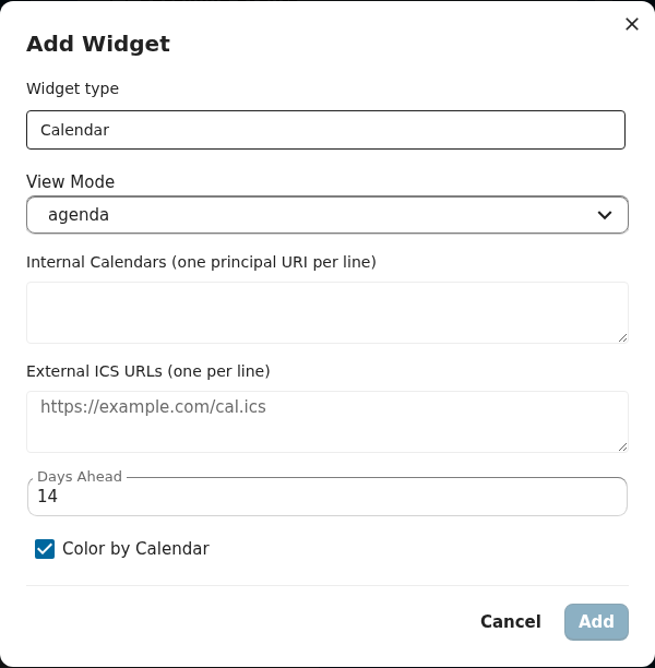
Agenda of upcoming events. Pulls from selected internal Nextcloud calendars and any number of external ICS feeds.
Renderer: CalendarWidget.vue · Form: CalendarForm.vue · Spec: openspec/specs/calendar-widget/spec.md
| Field | Default | Notes |
|---|---|---|
internalCalendars[] | [] | Calendar names from CalDAV. |
externalIcsUrls[] | [] | Public ICS URLs. |
viewMode | agenda | agenda / month. |
daysAhead | 14 | Look-ahead window. |
colorByCalendar | true |

links
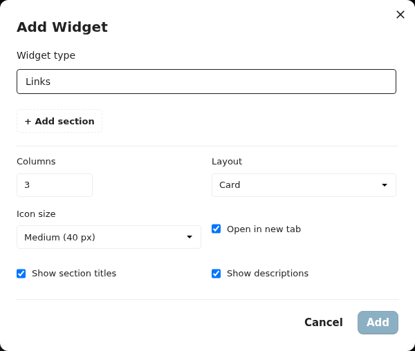
A sectioned link directory — each section has a title and N links. Ideal for an intranet-style "useful links" panel.
Renderer: LinksWidget.vue · Form: LinksForm.vue · Spec: openspec/specs/links-widget/spec.md
| Field | Default | Notes |
|---|---|---|
sections[] | [] | {id, title, links: [{id, label, url, description, icon}]}. |
columns | 3 | |
linkLayout | card | card / inline. |
iconSize | medium | |
openInNewTab | true | |
showSectionTitles / showLinkDescriptions | true / true |

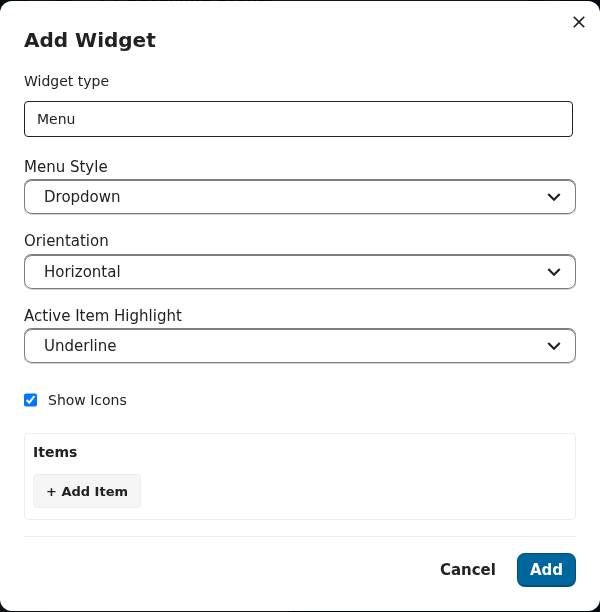
menu
A navigation menu — dropdown or always-expanded, horizontal or vertical.
Renderer: MenuWidget.vue · Form: MenuForm.vue · Spec: openspec/specs/menu-widget/spec.md
| Field | Default | Notes |
|---|---|---|
items[] | [] | {id, label, url, icon, children?}. |
style | dropdown | dropdown / expanded. |
orientation | horizontal | horizontal / vertical. |
showIcons | true | |
expandedByDefault | false | |
activeItemHighlight | underline | underline / background / none. |

container
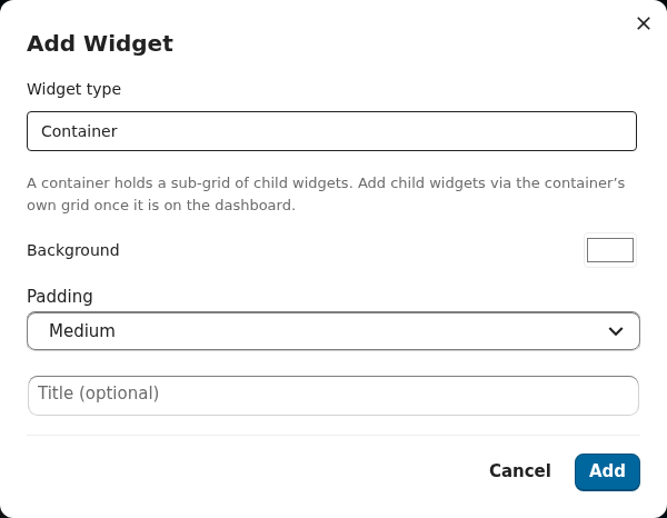
A recursive sub-grid host. Children live in content.placements[] and render through the inner GridStack instance bounded by the container's outer cell. Server-side REQ-CONT-006 caps recursion at 3 levels deep so a malformed payload can't blow up the renderer.
Renderer: ContainerWidget.vue · Form: ContainerForm.vue · Spec: openspec/specs/container-widget/spec.md
| Field | Default | Notes |
|---|---|---|
placements[] | [] | Child placements (recursive — same shape as a top-level placement). |
backgroundColor | transparent | |
padding | medium | none / small / medium / large. |
title | '' | Optional section title. |

tile
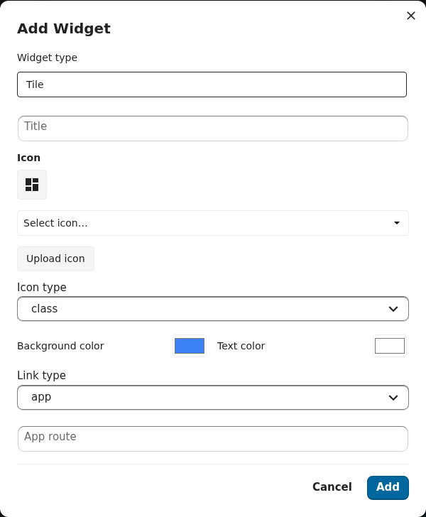
The registry-driven replacement for the deprecated standalone tile-creation flow. The renderer reads from BOTH the new inline content.{...} shape AND the legacy flat placement.tile* columns, so dashboards holding tile placements created via the deprecated oc_launchpad_tiles flow keep rendering without a migration step.
Renderer: TileWidget.vue · Form: TileForm.vue · Spec: openspec/specs/tiles/spec.md
| Field | Default | Notes |
|---|---|---|
title | '' | Tile label. |
icon | '' | Material icon class or SVG path. |
iconType | class | class / svg. |
backgroundColor / textColor | #3b82f6 / #ffffff | |
linkType | app | app / external / internal. |
linkValue | '' | App id, URL, or internal route. |

OpenRegister analytics widgets
These 8 types are contributed by the communal dashboardWidgetRegistry in
@conduction/nextcloud-vue and
resolve their data from OpenRegister at render time — so they need OpenRegister
installed with data. Their renderers and sub-forms live in @conduction/nextcloud-vue
(CnStatWidget, CnChartWidget, …), not in src/components/Widgets/. They share a
content.dataSource block: { register, schema, filter?, aggregate|groupBy|bucket },
where register/schema are OpenRegister slugs picked from the form's paired
Register/Schema dropdowns.
stat
A single headline KPI. Resolves one number from an OpenRegister aggregate (count or a metric over a field) and renders it as a large formatted figure with an optional caption and click-through. Use it for: "open leads", "documents this month".
Renderer: CnStatWidget (nc-vue) · Form: CnStatWidgetForm · Spec: openspec/specs/stat-widget
| Field | Notes |
|---|---|
dataSource.register / schema | OpenRegister slugs. |
dataSource.aggregate | count or { metric, field }. |
caption / icon / route | Optional chrome + click-through. |
delta
Comparison card. Resolves a current and a previous aggregate (two time windows) and
renders the current value plus the signed percentage change, coloured by goodDirection.
Use it for: "revenue vs last month", "new cases week-over-week".
Renderer: CnDeltaWidget (nc-vue) · Form: CnDeltaWidgetForm
| Field | Notes |
|---|---|
dataSource | register + schema + the metric. |
currentWindow / previousWindow | The two comparison ranges. |
goodDirection | up or down — drives the green/red colour. |
gauge
Radial gauge of a value against a target, coloured by warn/danger thresholds. Use it for: "storage used", "SLA attainment", "budget consumed".
Renderer: CnGaugeWidget (nc-vue) · Form: CnGaugeWidgetForm
| Field | Notes |
|---|---|
dataSource | register + schema + value metric. |
target | The 100% reference value. |
warnThreshold / dangerThreshold | Colour bands. |
stats-block
A labelled count card. Pulls a count from OpenRegister's GraphQL endpoint and renders it
in the shared CnStatsBlock. Use it for: a compact "N objects" tile.
Renderer: CnStatsBlockWidget (nc-vue) · Form: CnStatsBlockWidgetForm
| Field | Notes |
|---|---|
dataSource.register / schema | The collection to count. |
label | Card label above the count. |
chart
ApexCharts wrapper (bar / line / area / pie / donut / radialBar). Two breakdown modes:
category (groupBy a field → one bar per value) and time-series (bucket a date
field by month/week → a trend line). apexcharts / vue-apexcharts are peer deps.
Use it for: "characters by type", "cases opened per month".
Renderer: CnChartWidget (nc-vue) · Form: CnChartWidgetForm
| Field | Notes |
|---|---|
chartKind | bar / line / area / pie / donut / radialBar. |
dataSource.register / schema | Source collection. |
dataSource.groupBy | { field, metric: 'count', sort, limit } — category mode. |
dataSource.bucket | { field, interval: 'month', metric } — time-series mode. |
Example content for a bar chart of larping characters by type:
{ "chartKind": "bar",
  "dataSource": { "register": "larpingapp", "schema": "character",
    "groupBy": { "field": "type", "metric": "count", "sort": "desc", "limit": 8 } } }
object-list
Fetches a filtered page of OpenRegister objects (register + schema + filter + sort + limit) and renders them as a compact column table. Use it for: "latest 10 leads".
Renderer: CnObjectListWidget (nc-vue) · Form: CnObjectListWidgetForm
| Field | Notes |
|---|---|
dataSource.register / schema | Source collection. |
dataSource.filter / sort / limit | Query controls. |
columns | Which schema fields to show. |
table
Compact data table with a card wrapper, title header, and optional "View all" footer.
Two data modes: pass rows directly, or self-fetch via register + schemaId. Shares the
object-list sub-form. Use it for: an embedded report table.
Renderer: CnTableWidget (nc-vue) · Form: CnObjectListWidgetForm
| Field | Notes |
|---|---|
rows | External rows (when not self-fetching). |
register / schemaId | Self-fetch source. |
viewAllLink | Optional footer link. |
spend-analytics
Financial spend-analytics widget with period tabs (month / quarter / year). Reads from the
financeq (transactions) and procest (vendor commitments) sibling apps via their
/graphql endpoints; renders a graceful empty state when a sibling is absent. Use it
for: a procurement/finance overview. Requires financeq and/or procest installed.
Renderer: CnSpendAnalyticsWidget (nc-vue) · Form: CnSpendAnalyticsWidgetForm
| Field | Notes |
|---|---|
period | month / quarter / ytd / fy. |
categoryIds / departmentIds | Optional filters passed to the finance query. |